position-fixed
우리가 사용하는 웹페이지 화면을 보면 오른쪽 하단이나 메뉴 등이 고정돼있는 경우를 많이 봤을 것이다.
예를 들면 밑의 사진처럼 웹에서 블로그 글을 작성할 때 상단 도구 바,

웹에서 쇼핑을 할 때 양측 사이드 광고 블록 등
마우스 스크롤을 해도 화면 내용만 바뀔 뿐 고정된 콘텐츠들이 있다.
이것을 바로 position의 fixed 속성을 사용하여 고정해주는 것이다.
z-index
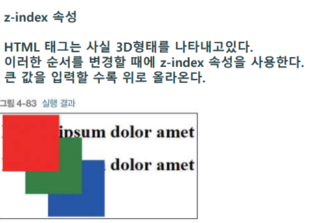
위에 설명한 absolute 3색 예제를 보면 파란색이
빨간색, 노란색 둘 다 덮어 위에 표시되는 것을 알 수 있다. 포지션은 z 축을 사용하는 것이다.
그러므로 z-index 속성을 사용하여 우선순위 등을 정해주어야 하는 경우가 있다.
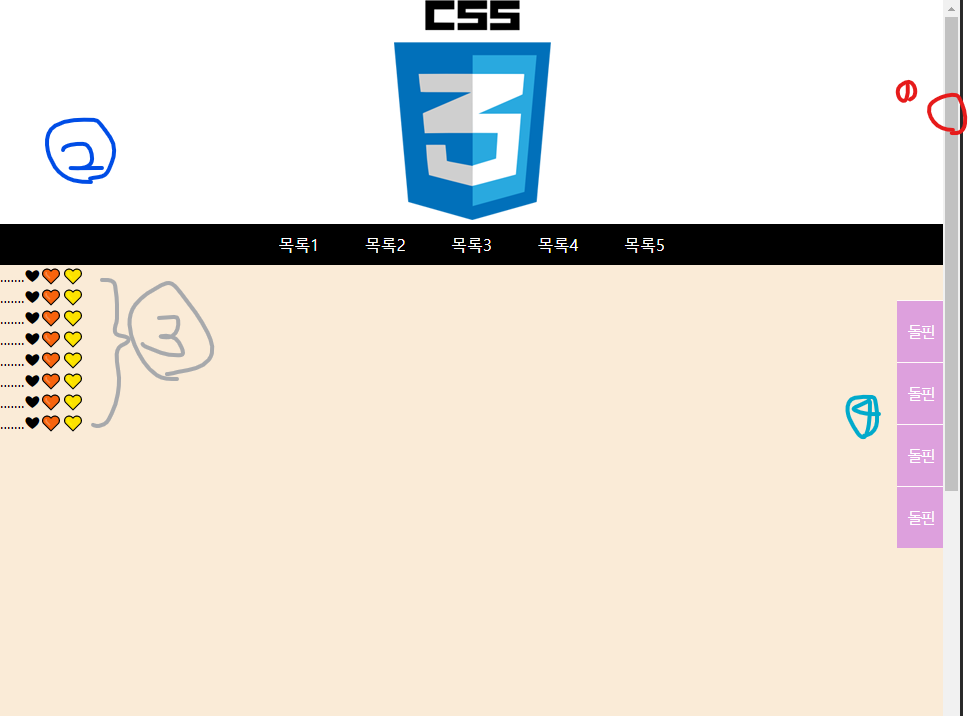
1번 빨간 동그라미로 콘텐츠의 높이를 스크롤로 확인해야 할 만큼 준 걸 확인할 수 있다.
2번 사진과 메뉴 부분을 포지션 fixed로 고정하여 상단에 위치시켰다.
3번 스크롤의 움직임에 따라 fixed 됨을 확인할 수 있도록 텍스트와 배경을 넣었다.
4번 fixed 사이드 메뉴이다.
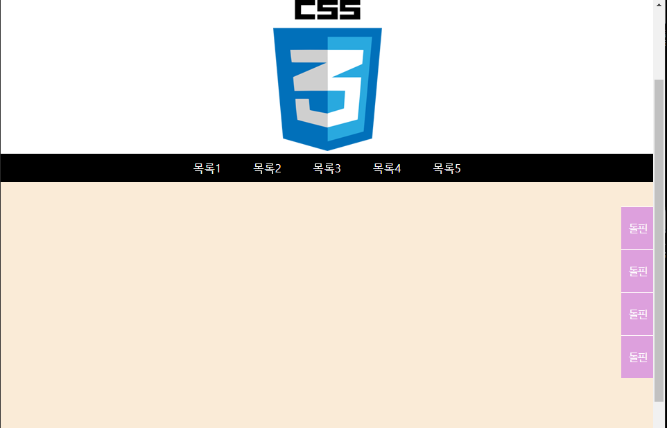
이렇게 오른쪽 사이드 스크롤바가 내려갔고 써놓은 글들이 올라가 사라진 것을 볼 수 있다.
그리고 fixed 된 메뉴와 사이드 메뉴 바는 여전히 화면에 보이는 것을 확인할 수 있다.
코드 원문
<!DOCTYPE html>
<html lang="en">
<head>
    <meta charset="UTF-8">
    <meta http-equiv="X-UA-Compatible" content="IE=edge">
    <meta name="viewport" content="width=device-width, initial-scale=1.0">
    <title>Document</title>

    <style>
        * {padding: 0; margin: 0;}
        ul, li {list-style: none;}
        img {max-width: 100%; height: auto;}
        header {position: fixed; left: 0; top: 0; width: 100%;
        z-index: 10;}
        .logo {text-align: center; background-color: white;}
        .gnb {background-color: black;}
        .menu {text-align: center;}
        .menu > li {display: inline;}
        .menu > li > a {
            display: inline-block;
            padding: 10px 20px;
            color: white;
            text-decoration: none;
        }
        .menu > li > a:hover {background-color: #777;}

        section {
            height: 1500px;
            background-color: antiquewhite;
            margin-top: 265px;
        }

        .side {
            position: fixed;
            right: 0; top: 300px; z-index: 5;
        }

        .side > ul > li > a {
            display: block;
            padding: 20px 10px; color: white;text-decoration: none;
            background-color: plum;
            border-top: 1px solid snow;
            letter-spacing: -3px;
        }

    </style>

</head>
<body>
    <header>
        <div class="logo"> <!-- Image area-->
            <img src="../image/css3.png" alt="">
        </div>
        <nav class="gnb">
            <ul class="menu">
                <li><a href="#">목록1</a></li>
                <li><a href="#">목록2</a></li>
                <li><a href="#">목록3</a></li>
                <li><a href="#">목록4</a></li>
                <li><a href="#">목록5</a></li>
            </ul>
        </nav>
    </header>

    <section>
        <aside class="side">
            <ul>
                <li><a href="#">돌핀</a></li>
                <li><a href="#">돌핀</a></li>
                <li><a href="#">돌핀</a></li>
                <li><a href="#">돌핀</a></li>
            </ul>
        </aside>
        .......❤🧡💛<br/>
        .......❤🧡💛<br/>
        .......❤🧡💛<br/>
        .......❤🧡💛<br/>
        .......❤🧡💛<br/>
        .......❤🧡💛<br/>
        .......❤🧡💛<br/>
        .......❤🧡💛<br/>
    </section>

</body>
</html>
여기서 직관적으로는 백그라운드 색상이 메뉴 밑부터 쌓였다고 생각할 수 있지만
사실 상단 메뉴 뒤에 들어가 안 보이는 상태이다.
그러므로 상단 메뉴 전체에는 z-index를 통해 백그라운드보다 높은 값을 주어진 상태이다.
header {position: fixed; left: 0; top: 0; width: 100%;
        z-index: 10;}
        .logo {text-align: center; background-color: white;}
우측 사이드 메뉴 바 또한 z-index를 통해 백그라운드보다 높이 있는 것을 알 수 있다.
.side {
            position: fixed;
            right: 0; top: 300px; z-index: 5;
        }
'웹 프론트엔드(Web FrontEnd)' 카테고리의 다른 글
| [CSS] 패딩과 마진 (padding, margin 속성을 통한 레이아웃 구성) (0) | 2022.09.26 |
|---|---|
| [HTML, CSS] display 속성 (메뉴 만들기) (1) | 2022.09.26 |
| [CSS] float를 활용한 쇼핑몰 물건 판매 예제 (1) | 2022.09.19 |
| [CSS] Overflow 오버플로우 ( 내용이 넘칠 때 ) (0) | 2022.09.05 |
| [CSS] border & text 속성 ( + 글자 가운데 정렬 방법 ) (0) | 2022.09.05 |


